Basic Content
Credit: Blueriver
Content Types
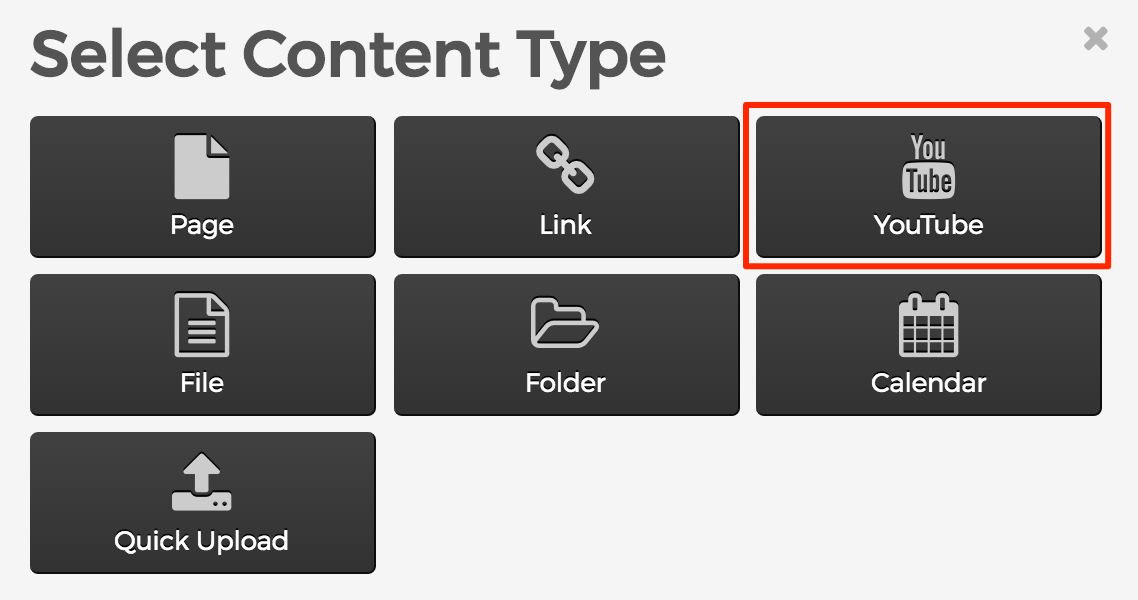
In Mura CMS, it's important to understand that there are different types of content. For example, sometimes you may want to create a traditional "page" of content, where there's a body area of text and images. Other times, you may want to add a "file" such as a PDF document, image file, or a link to another website.
One very important distinction here is that each content type has several attributes and features such as the ability to use categories, tags, and control whether or not the item will display or not, or even restrict access to the information to specific group(s). Please take a moment and review each of the basic content types listed below.
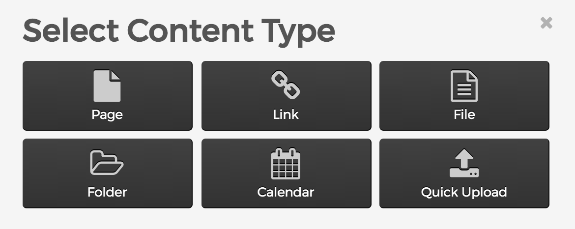
Page
Page content types are the website pages of your site. These are the most commonly used content types containing text, images, and links.
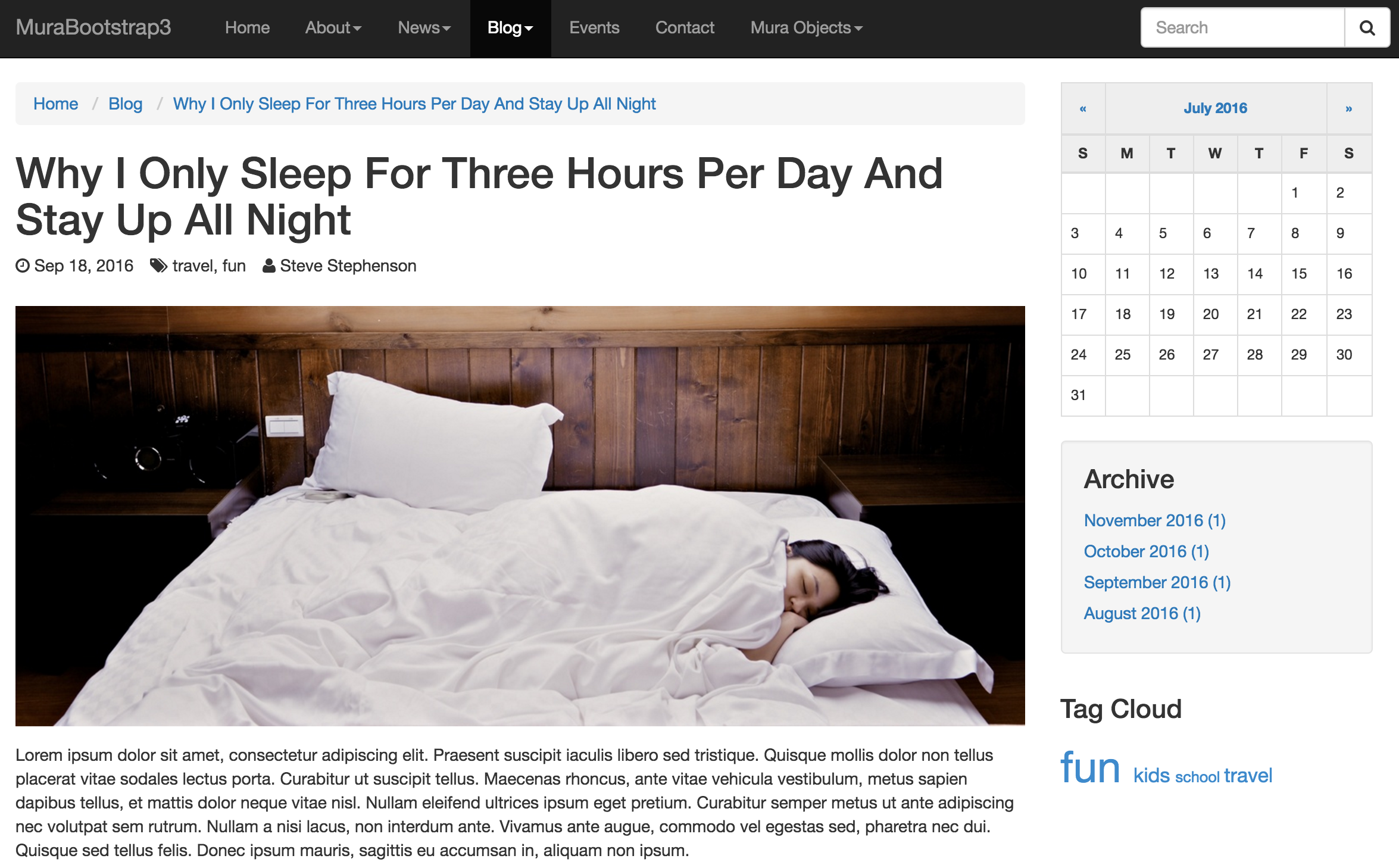
Link
Link content types are simply URL links. They can be used to link to another section of your existing website, or to external websites.

File
File content types are specifically any kind of file type that the system administrator has allowed Mura CMS to manage. File icons are used to denote most of the common file types such PDF, Word, Excel, Zip, and many others.

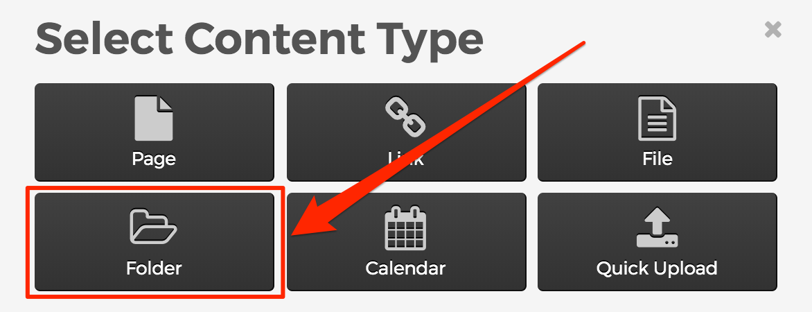
Folder
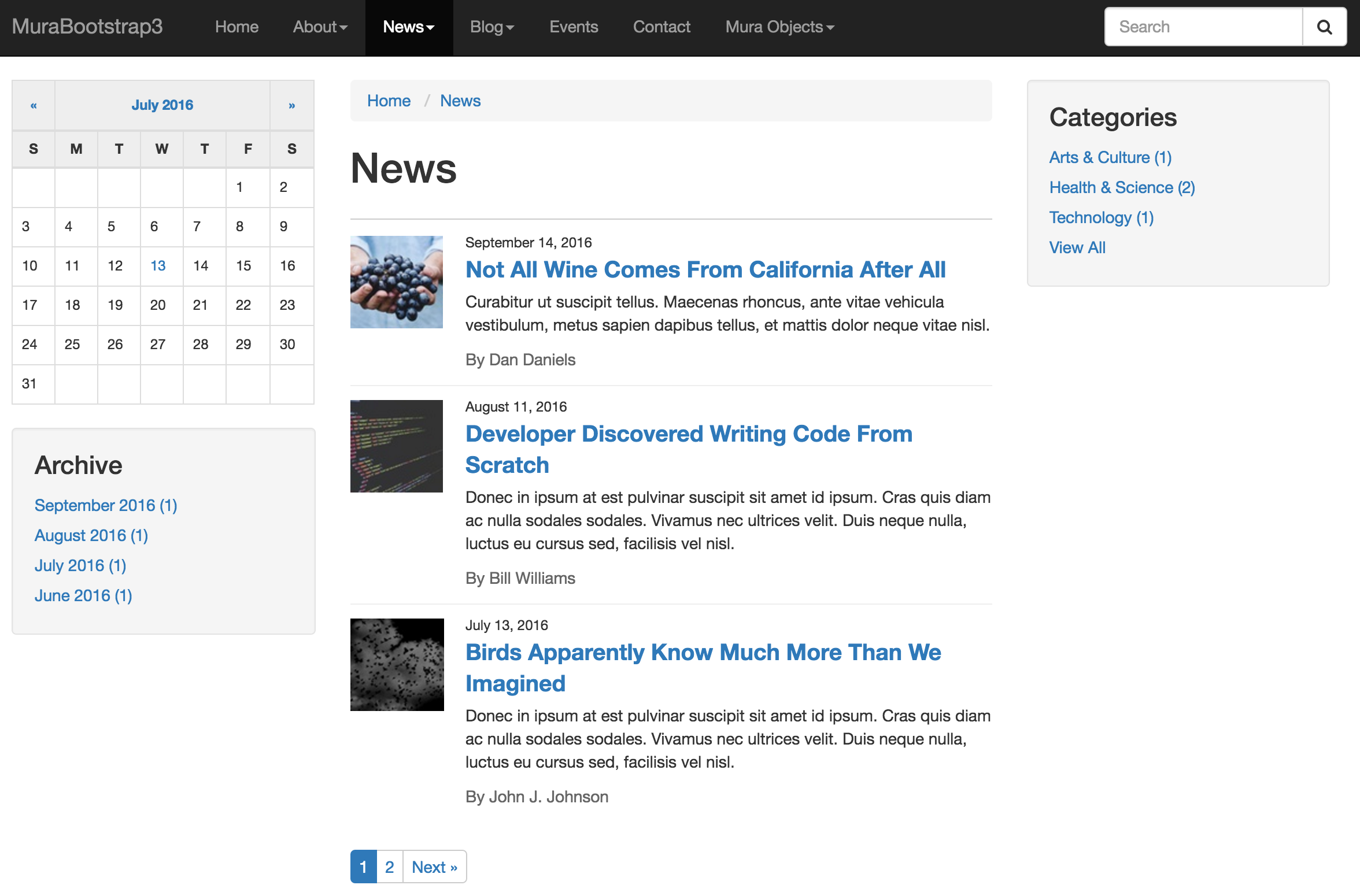
Folder content types allow you to aggregate related content into a defined group. Folders are most often used for sections of the site that may contain "news" or "blog" type content. For example, folders typically display the "title" and "summary" fields of each content item that lives directly beneath it, and pagination occurs automatically. Folders are also configurable to display several other fields such as the content release date, categories, tags, how many items to display per page, and more. The folder’s “body” area will appear above the listing of content that lives beneath it.
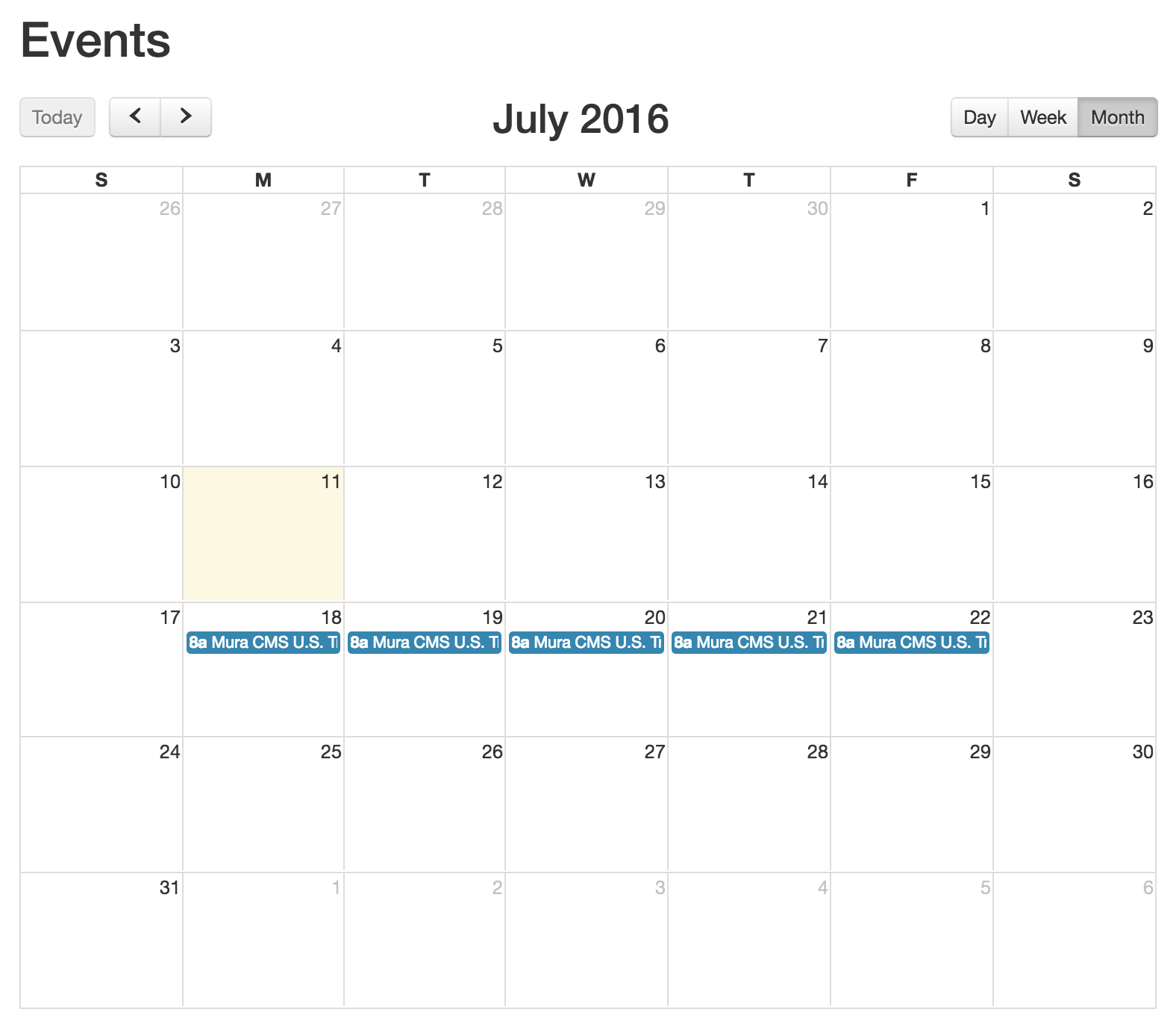
Calendar
Calendar content types allow you to display scheduled content in a traditional calendar format. Content placed directly under a "calendar" is scheduled by its "schedule" and has a number of configurable options such as whether or not the item should repeat, the frequency of when it should display, and more.
Quick Upload
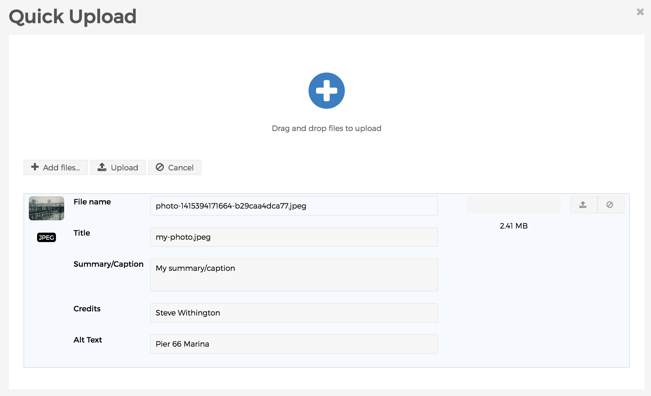
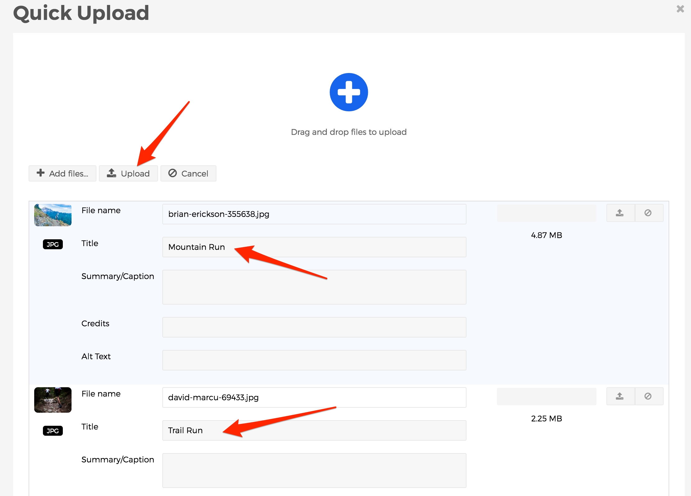
Quick Upload is not a content type. Rather, it's a way to upload multiple files, such as images and/or documents, all at once instead of having to upload each item individually. This is very useful when you wish to create a gallery of images, or even a library of documents.
Custom Content Types
Custom Content Types may also be created by your website development team in order to accommodate unique data specific to your organizations requirements or needs. For example, maybe your organization hosts a large number of YouTube videos. In that case, a developer might use "class extensions" to create a special content type called "YouTube" which collects the URL to the video, and other important information about that video. Then, using custom code in your theme or via a plugin, the content may be displayed in a special way on the front end of your site.
Admin Content View
There are many things you can do on the back-end administration view of Mura CMS that you cannot do on the front-end public view. Here, we'll explore the "Content" area of the "Admin View" and learn how to find content we might be looking for to edit.
Content Tree View
The "Tree View" is the default "Content" view in Mura CMS. The default Tree View button option is "Site" and is described in this section; the two other button options under Tree View ("Components" and "Forms") are described elsewhere. From here, you can see all of the content in a hierarchical view, with the "Home" page being the topmost content item.
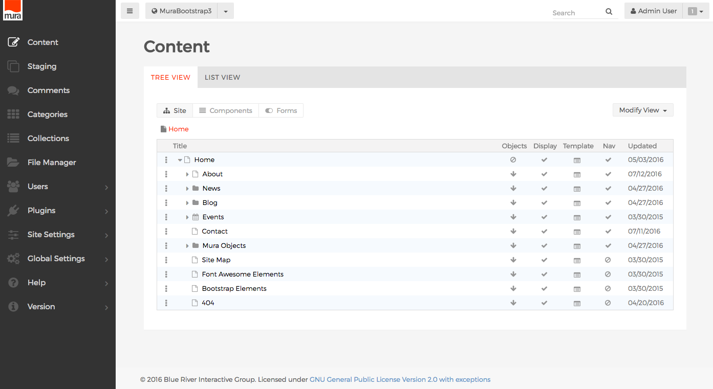
We'll discuss managing navigation menus in another section. However, it's important to note that each row in the list of content is listed in the order it will appear in the navigation on the front-end public view of the site. So, all of the top level navigation, or the "Home" page, and it's immediate children will appear in the primary navigation of your site by default.
You have several options for interacting with each row of content listed here. One option is clicking the vertical three dots on the far left of each row to reveal a menu of options.
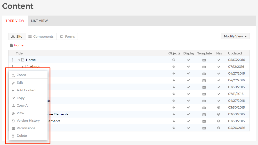
- Zoom: When a content item has children, selecting "Zoom" will drill into that section of the site. This often makes it easier to manage a specific section, or sub-section of a site without the clutter of viewing all of the siblings of a content item. You can keep track of where you are in context to the "Home" page by using the breadcrumbs found directly above the listing of content items.
- Edit: Select this option to go to the "Edit Content" screen.
- Add Content: Select this option to add a child content item.
- Copy: Select this option to copy the specific content item into memory. When you select this option, you can click the vertical three dots and a "Paste" option will appear so that you can paste the copied item.
- Copy All: Similar to "Copy" except it copies both the selected item, and all of its children.
- View: Launches a new browser window to see what the selected content item looks like on the front-end public view of your site.
- Version History: Selecting this option will take you to the "Version History" screen where you can perform actions such as comparing versions, and edit old versions to re-publish them.

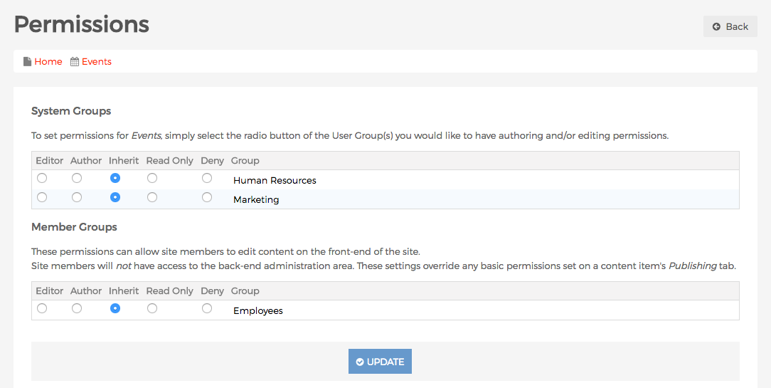
- Permissions: Selecting this option will take you to the "Permissions" screen for the specified content item so that you can control who has "Editor" and "Author" permissions, or even explicitly deny a group access to content.
- Delete: Selecting this option will generate an alert dialog to confirm whether or not you wish to delete the selected content item and all content nested beneath it.
Another option are the icons on the far right of each row.
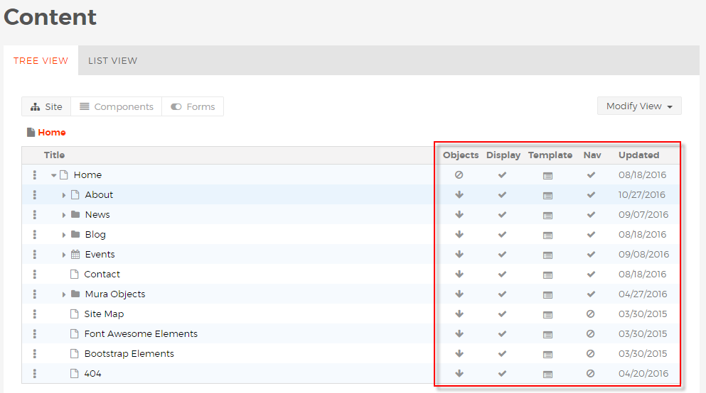
Objects: Objects can inherit or not inherit cascading, and they can also start a new cascade.
Display: The content is either displayed or hidden or controlled by a schedule; if hidden it can only be edited via the back-end administration area unless you know the URL to the page in order to edit via the front-end.
Template: The content can inherit the parent template, or use another template, and use an alternate child template for its children.
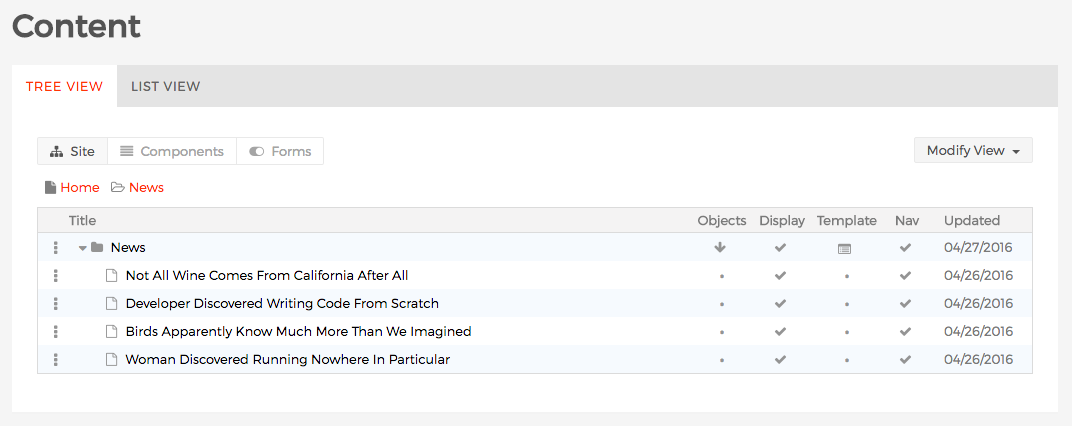
Nav: This option toggles whether or not a content item will appear in navigation generated by Mura. The navigation for the following page has been turned off:

It does not appear in the News section below:

Updated: The field indicates the date when the content was last changed.
Components
The "Components" button is one of the options displayed under the "Tree View" tab within the "Content" section of the Mura CMS back-end administration area. From here, you can see all of the existing components as well as create and maintain components. For more information about Mura Components, visit the Components section.

Forms
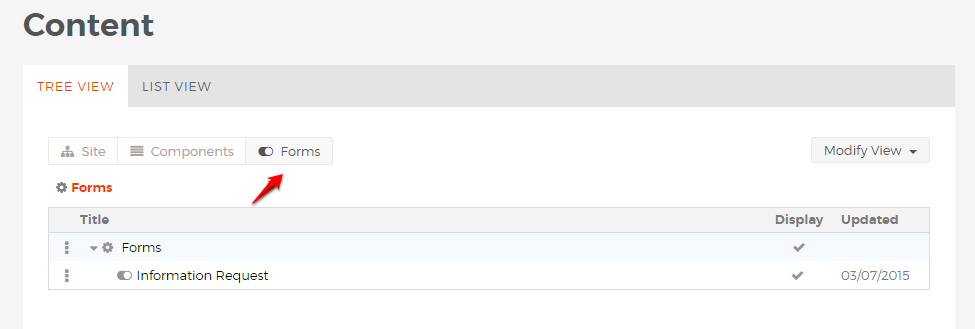
The "Forms" button is one of the options displayed under the "Tree View" tab within the "Content" section of the Mura CMS back-end administration area. From here, you can see all of the existing forms as well as create and maintain forms. For more information about Mura Forms, vist the Forms section.
Content List View
By default, the Content "List View" displays all of the content as a listing of search results, sorted by the date each item was last updated.
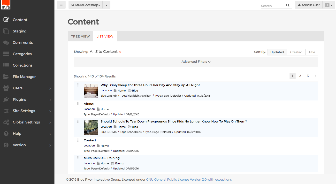
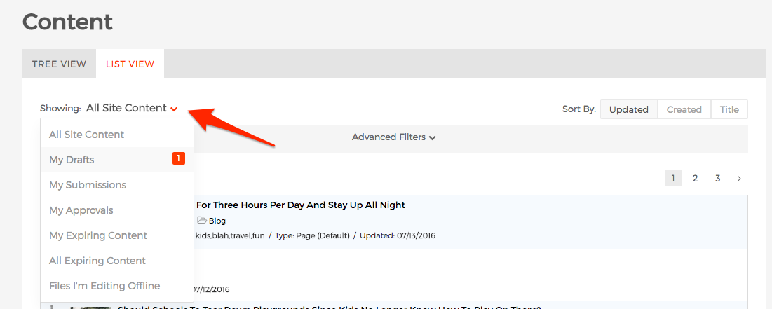
From this view, you can apply a number of different filters to narrow your search as desired. For example, you can easily toggle between all site content, drafts you've been working on, any submissions or approvals that have been assigned to you, and more by clicking the area next to "Showing:" as illustrated below.
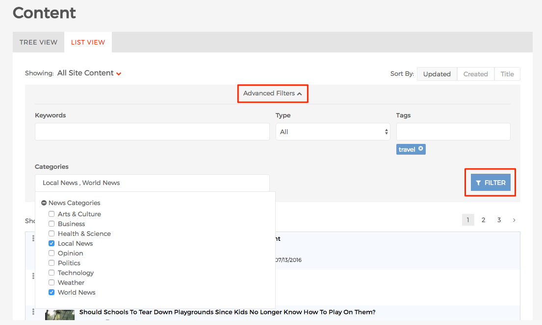
You can also apply several other filters. For example, clicking on "Advanced Filters" opens up another set of form fields that you can use to enter keywords, narrow by content type, tags, and categories. Simply click the "Filter" button when finished, and Mura will return any results that match the filters you've applied.
Basic Tab
When you select a content item to edit it, you're taken to the "Edit Content" screen. As you've probably already noticed, there are several tabs listed across the top of the screen.
Note: For information about the other tabs on this screen see the Tabs section.
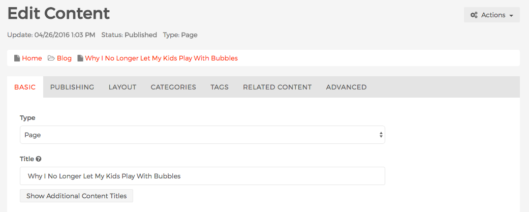
By default, the "Basic" tab is displayed. The "Basic" tab contains some of the most critical and commonly used form fields that are used for Mura CMS content. Also, it's important to note that this tab varies depending on the "Type" of content you are editing. For example, when you add a "File" content type, you won't see a "Content" field. Each of the form fields listed below apply to most content types though.
- Type: This displays the content type selected when the content item was created. You have the option to change the content type here. Some content types aren't exactly compatible with others, which is why you may not see "File" as an option when the original content item was a "Page" or "Folder" content type.
- Title: This is the most important field for any content item. It's also the only required form field by default. The text entered here typically appears as the page title, just above the content. The value entered here will be used to automatically create all other title fields, listed below, if they are left blank. Hence, when you change the value entered here, a prompt will be displayed asking if you wish to "Clear Additional Titles." Often times, you'll want to take advantage of this feature.
- Navigation Title (Optional): The value entered here will be used for any navigation that's automatically generated by Mura. For example, it will be the text displayed on the primary or sub-navigation of your site.
- URL Title (Optional): The value entered here will appear in the browser's address bar. For example, "About Us" would become "about-us" and when combined with the full domain, will appear as http://www.yourdomain.com/about-us/
- HTML (Browser) Title (Optional): The value entered here will appear on the browser's chrome or browser tab.
- Assign Associated Image: This is a very special field where you can upload a primary image to be used along with the content item itself. The first is when the content item is a direct child of a "Folder" content type, the image is typically displayed along with the Title, Summary, and a few other fields in the Folder listing. Next, it will typically display on the content item itself. The size, and placement are determined by the layout and theme used. It can also be displayed on a "Folder" when it's a direct child of the Folder itself in the listing.
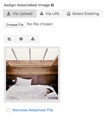
- You can either upload an image, enter a known URL of an image, or even select an existing associated by searching for one.
- The buttons above the image allow you to perform various actions.
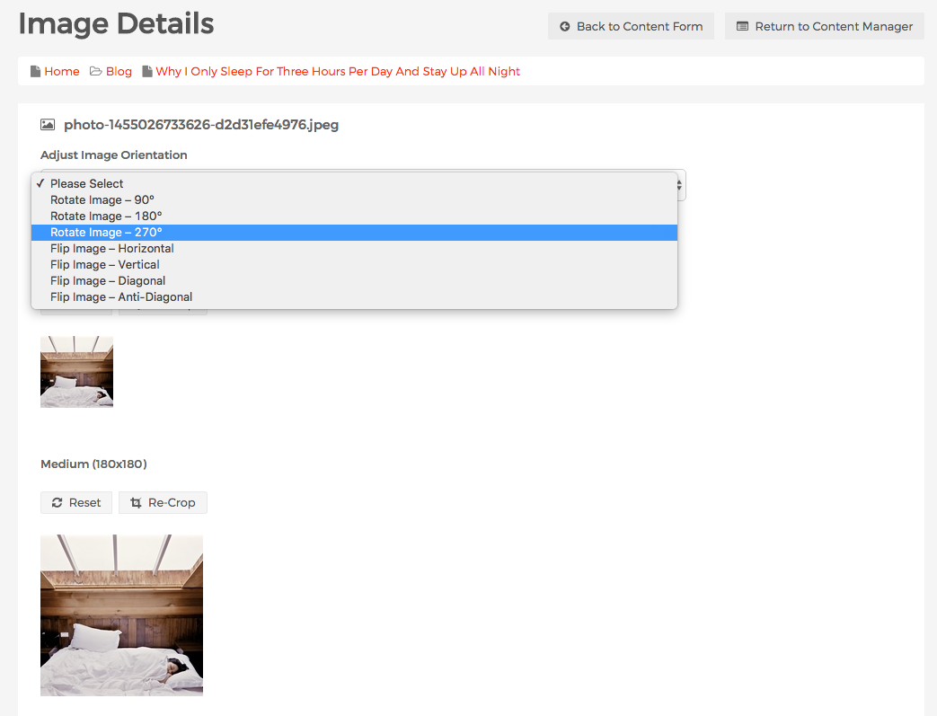
- The crop marks button will direct you to the "Image Details" screen where you can adjust the image orientation, as well as create new crops for each of the defined image sizes.
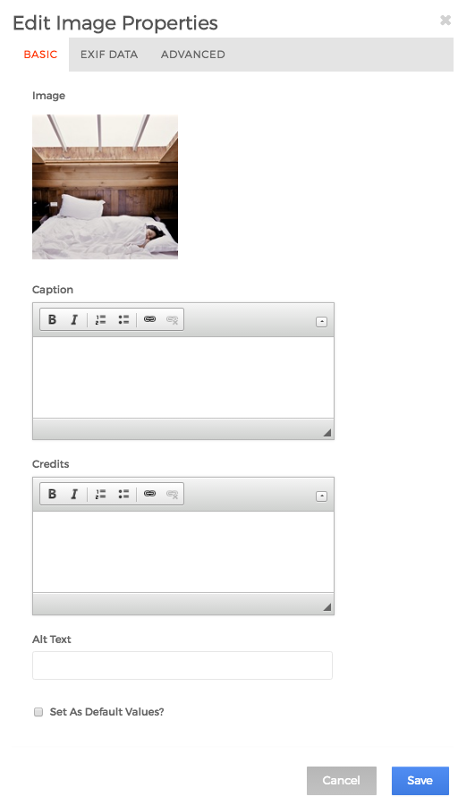
- The info button will launch the "Edit Image Properties" window. Here, you can enter values into a number of various metadata fields.
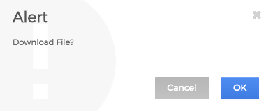
- The download button will launch an alert asking if you wish to download the file. Select "OK" to download.
- The crop marks button will direct you to the "Image Details" screen where you can adjust the image orientation, as well as create new crops for each of the defined image sizes.
- Summary: The text entered into this field is shown in special circumstances. The first is when the content item is a direct child of a "Folder" content type, the value from this field is typically displayed along with the Title, Associated Image, and a few other fields in the Folder listing. The other instance is when the content item has been restricted to public view, and the user attempting to view the content is not logged in. It will appear just above the log in screen. So, be careful to not enter any confidential information into this field unless your development team has instructed you that it's safe to do so because of some modification they've made to Mura CMS.
- Content: This is the main body, or "content" of the content item. It's here that you will enter your primary text, images, and links.
Content Formatting
When editing the "Content" or "Summary" fields in Mura CMS, you're actually using a web text editor. The editor comes with a number of very powerful features. First of all, if you click the question mark found on the far right of the last row of tools, a dialog window will appear informing you that the web text editor was created by CKEditor. While we'll cover some basics, you may find the CKEditor User's Guide a much more thorough resource.
The Toolbar
The first thing you'll notice when editing content with the web text editor is the toolbar that appears at the top of the editor window. A similar toolbar appears when you using "inline edit" mode on the front-end public view of your site as well. It contains menu buttons that give you access to various functions of the editor. All buttons are grouped according to their function and include both simple operations (like basic text styling or formatting) and more advanced features (like inserting media via a dialog window).

The CKEditor toolbar buttons are illustrated with meaningful icons. If, however, you are not sure what functions they perform, hover the mouse cursor over the buttons to see a tooltip with the name of the function.

Using the Toolbar
In order to perform an operation assigned to a button, click the button once. In most cases it will either immediately perform some predefined action or open a dialog window with further configuration options for a feature.
Remember that the toolbar can also be used with your keyboard. To enter the toolbar, use the Alt+F10 keyboard shortcut. To move to the next or previous button group, use the Tab and Shift+Tab keys, respectively. Within a button group, use the Left Arrow and Right Arrow keys to move between buttons of this group. To activate a selected toolbar button, press Enter or Space.
Some of the buttons serve as placeholders giving you access to further options placed in a drop-down list. They are easily recognizable thanks to a small icon on their right. Clicking the name or the arrow icon of such button expands the list and lets you choose one of its options via the left mouse button. To select a drop-down list option you can also use the Tab or the Down Arrow key and then accept your choice by pressing Enter or Space on your keyboard. To hide the list, use the Esc key or click anywhere in the browser window.
Collapsing and Restoring the Toolbar
To save on screen estate, you can collapse the toolbar by pressing the  button or using the Alt+- (minus) keyboard shortcut. In order to return to the full toolbar view, press the same button or keyboard shortcut again.
Uploading Images and Files
Mura CMS uses CKFinder for its web file manager, which is maintained by the same organization that created CKEditor. CKFinder is a file manager that can help you browse, upload, and manage files located on a web server - directly from your Internet browser and without the need to install anything on your computer. For complete documentation on how to use CKFinder, please visit http://docs.cksource.com/CKFinder_2.x/Users_Guide.
How to Create a Photo Gallery
As previously mentioned in the Folder section, Folders allow you to aggregate related content into a defined group. While they are typically used to keep content such as "news" or "blog" posts together, they may also be used to create photo galleries. In fact, there's nothing stopping you from creating a "folder of galleries" or "galleries of galleries".
To create a custom photo gallery, follow the steps outlined below.
- Navigate to the section of your site where you wish to add a photo gallery (or gallery of galleries, etc.), then add a "Folder" content item.
- In the "Title" field, enter the name of your gallery. For example, "My Photo Gallery".

- When finished, select your desired publishing option.

- Now that you've created a new Folder, you can add your images in a few different ways. First, keep in mind, this is just a Folder. So, you can add multiple "Pages", and just make sure you use the "Assign Associated Image" field to add your desired image for each page (this is essentially how "news" or "blog" posts are created. You could also add a "File" content type, and select an image as your file to upload. Or, you could use the "Quick Upload" feature to upload multiple images at the same time. Finally, you could select the "Folder" content type, and use the "Assign Associated Image" field for your image. In fact, using a specified image for the nested Folder is a great way to create "galleries of galleries".
- The example below is using the Quick Upload feature to upload multiple images at the same time. When using this feature, keep in mind that you're able to modify the "Title" of the image before it's uploaded.
- After you've completed uploading all of your images as content items, whether it's Pages, Folders, Files, or you used the Quick Upload feature, you're ready to customize your Folder to make it function more like a traditional photo gallery, because your gallery will display just like any other Folder does by default.
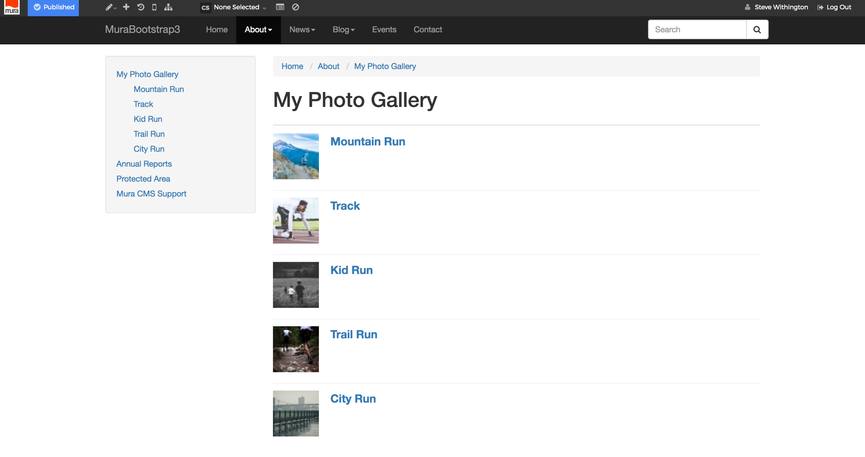
- From the front-end view of your site, hover over the pencil icon, then select "Inline Edit".
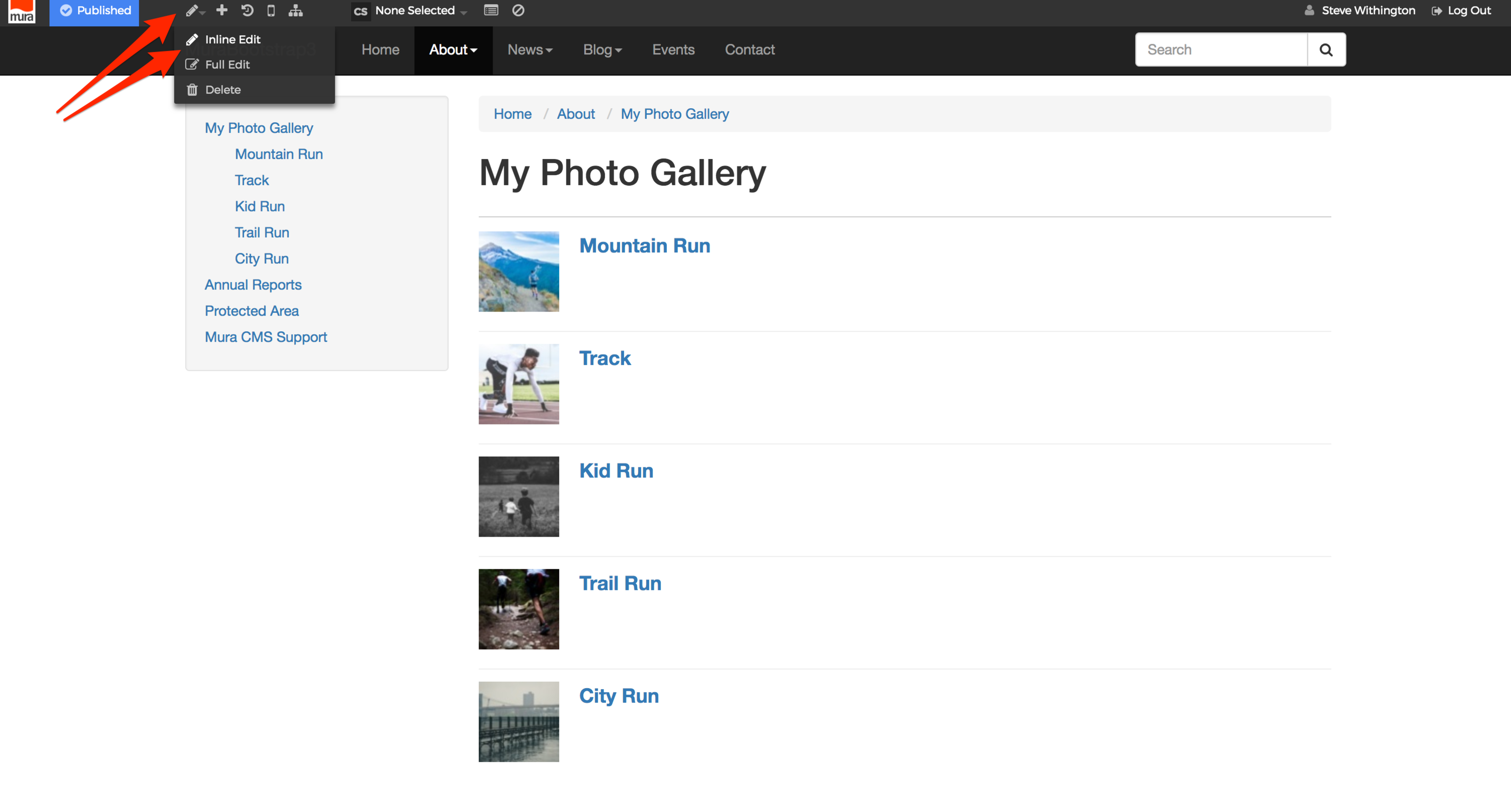
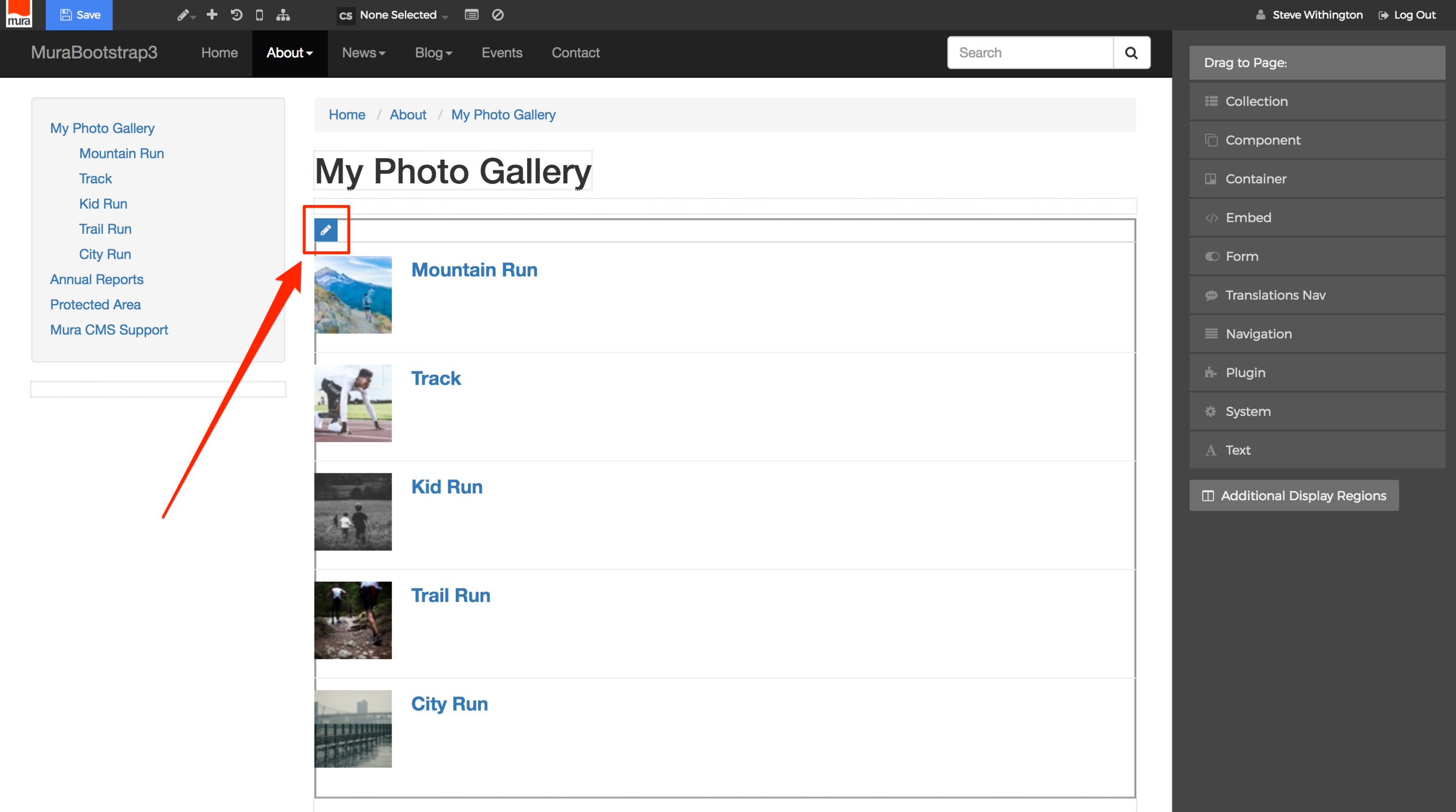
- Hover your mouse over the list of images in the body area, and click the pencil icon which should appear in the top-left corner of the region.
- The display object panel should now reveal the "Folder" configuration panel.
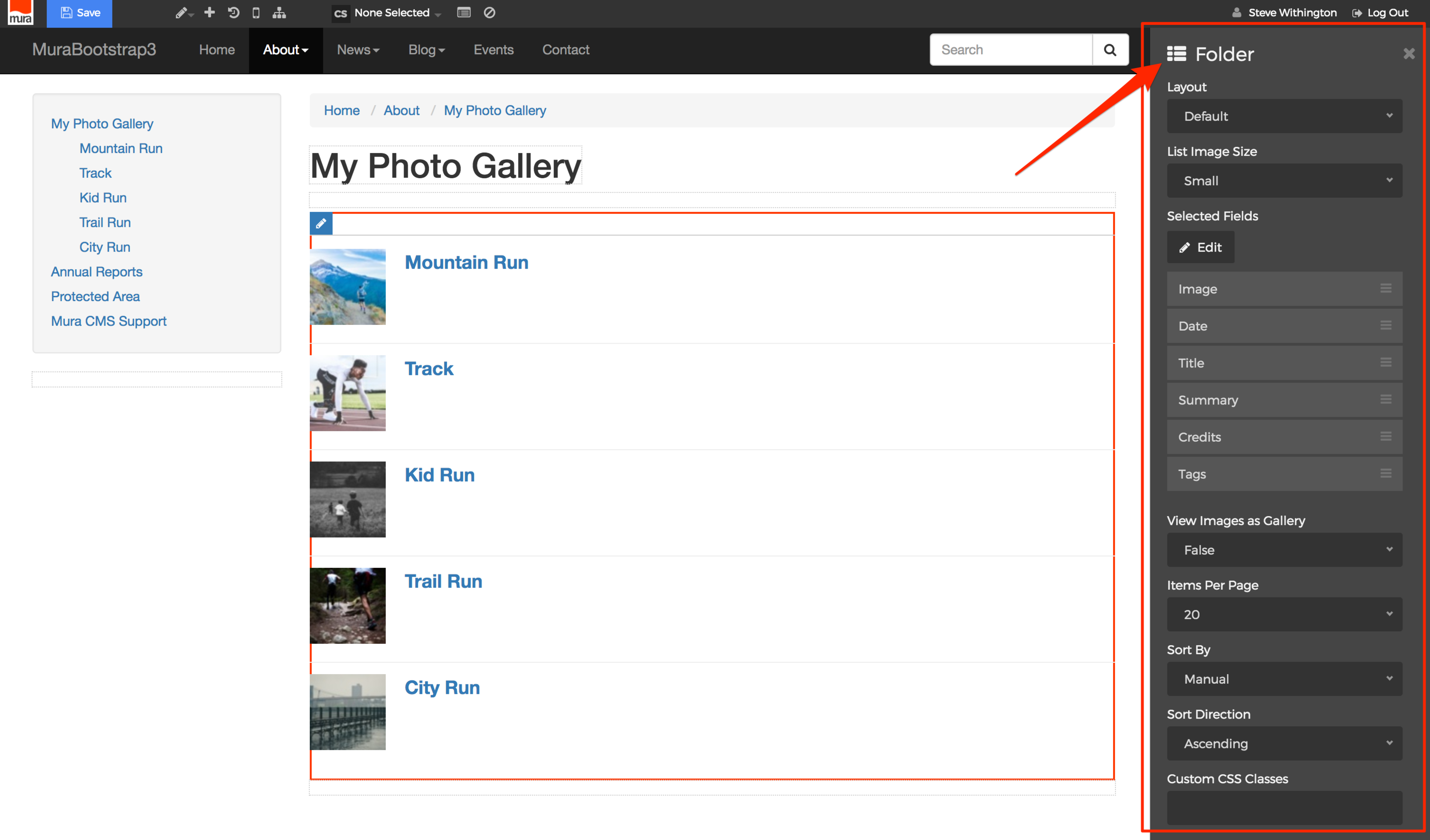
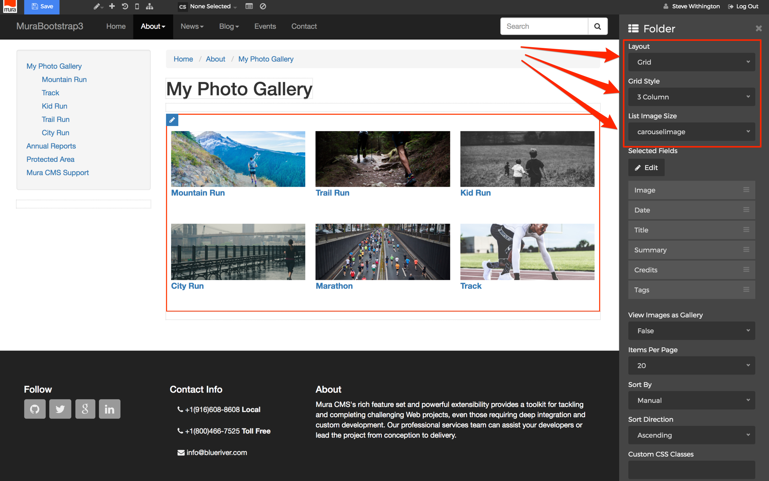
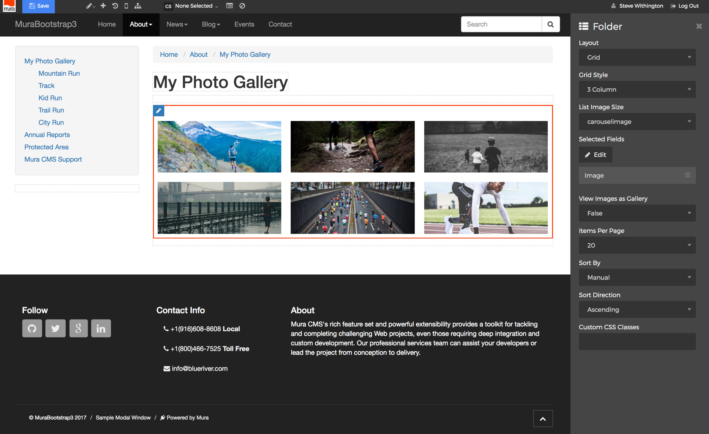
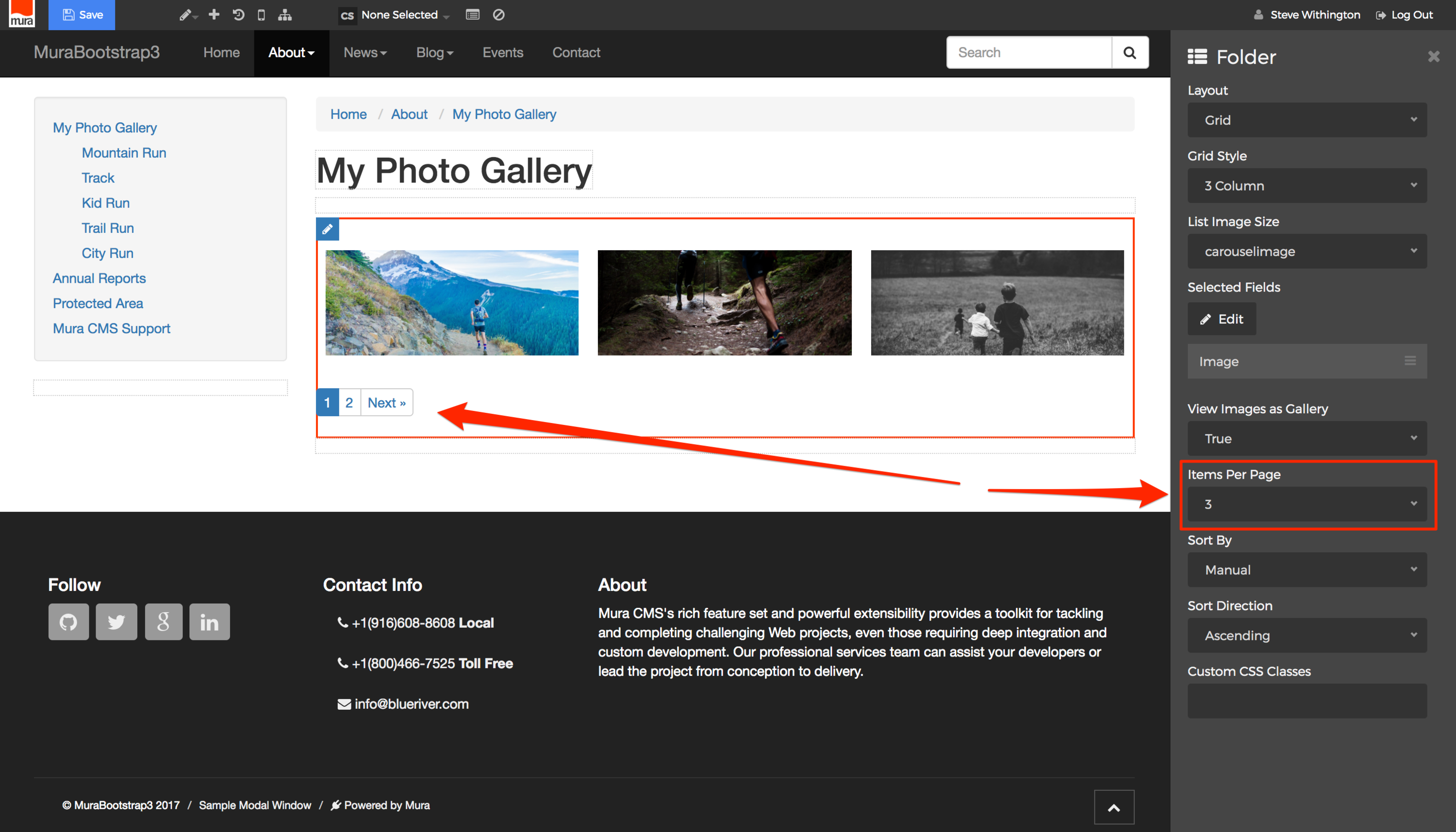
- From the "Folder" configuration panel, you may select your Layout, List Image Size, which Selected Fields you wish to display, Items Per Page, and more. For example, for the Layout, select "Grid", then select your desired "Grid Style" option and "List Image Size". You'll see the display automatically update as you make each selection, so you'll know what the gallery will look like for your site visitors.
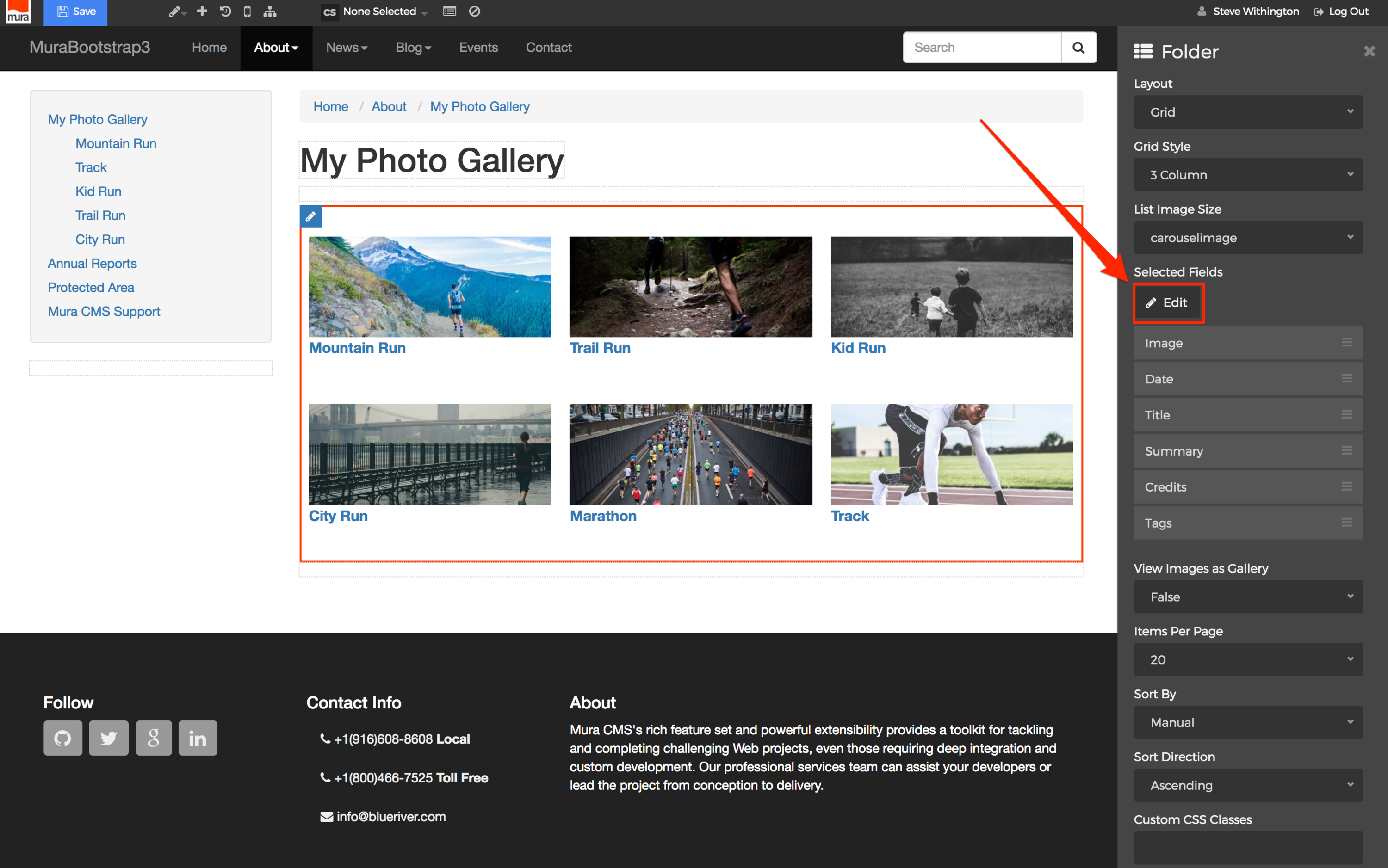
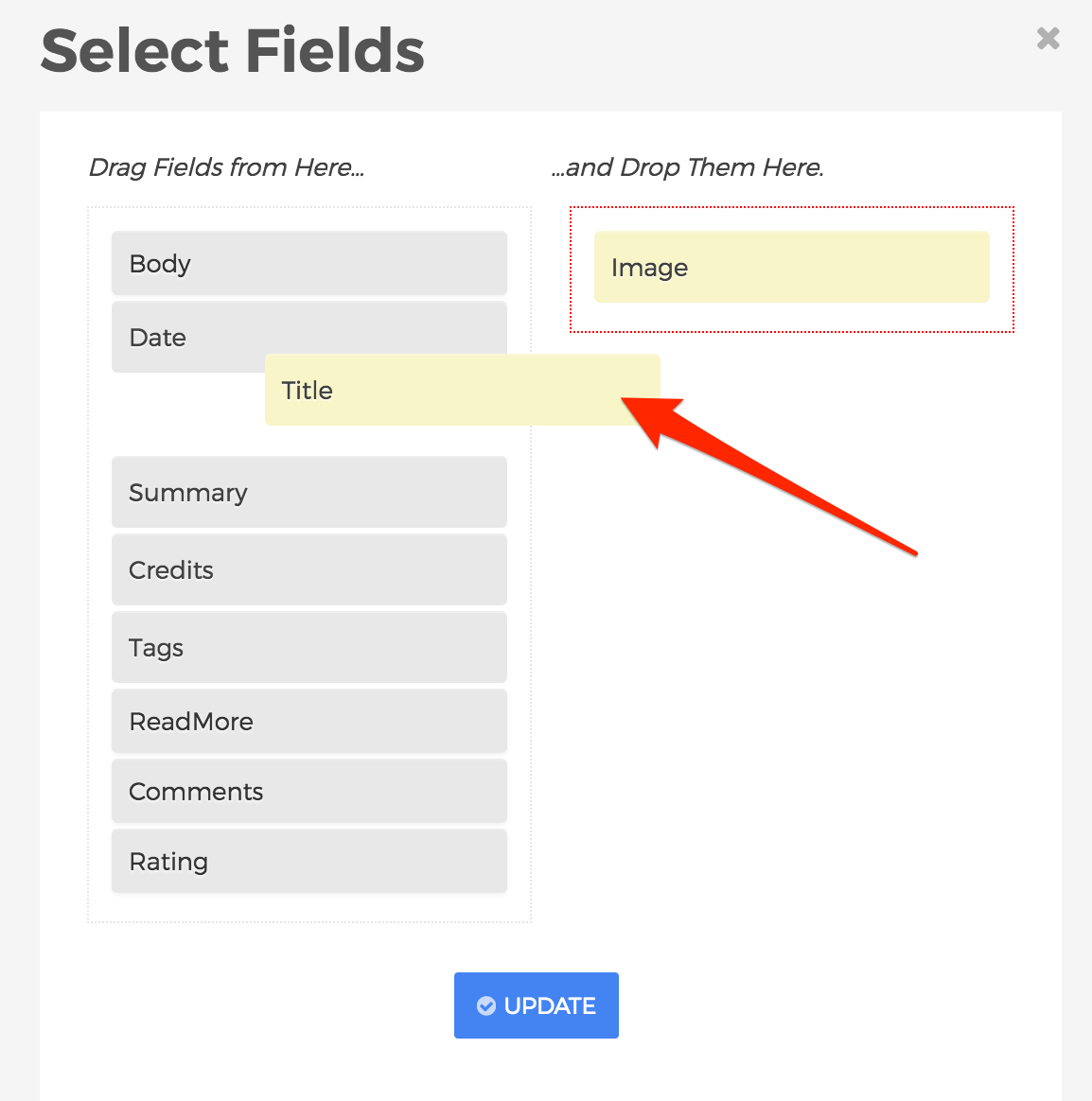
- If you don't want the Title of each image to appear, select the "Edit" button beneath the "Selected Fields" label.
- The "Select Fields" dialog window should open. From here, you may click, drag and drop the field(s) you wish to display, or not display by moving them from one column, to the other.
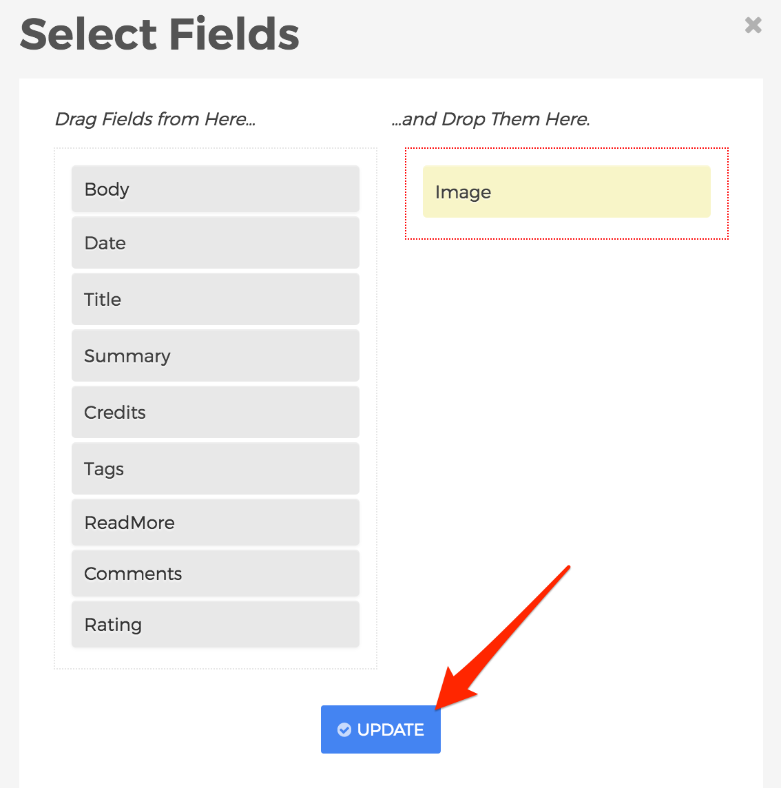
- When finished selecting your desired fields, click Update.
- The body area will update to reflect your updates.
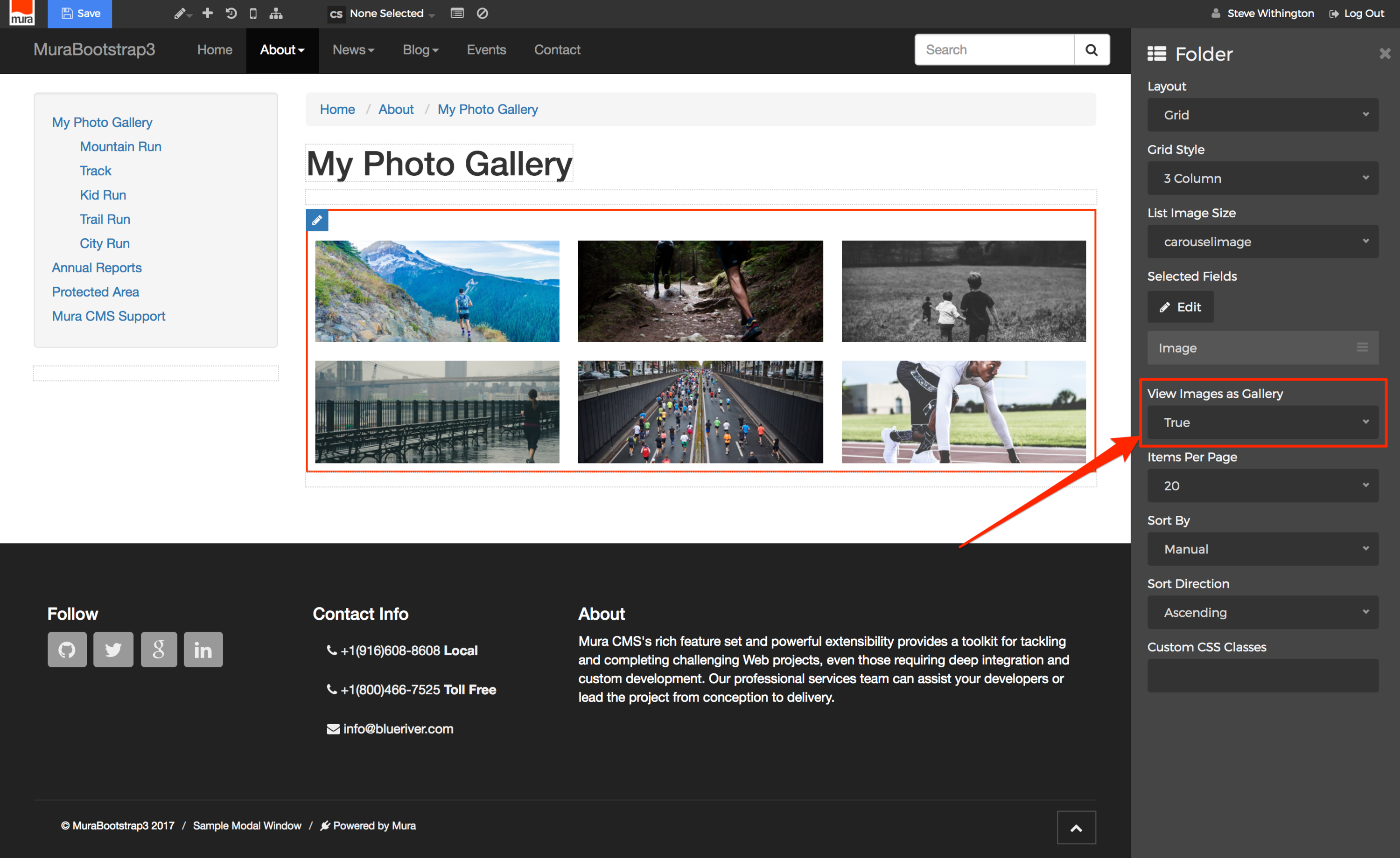
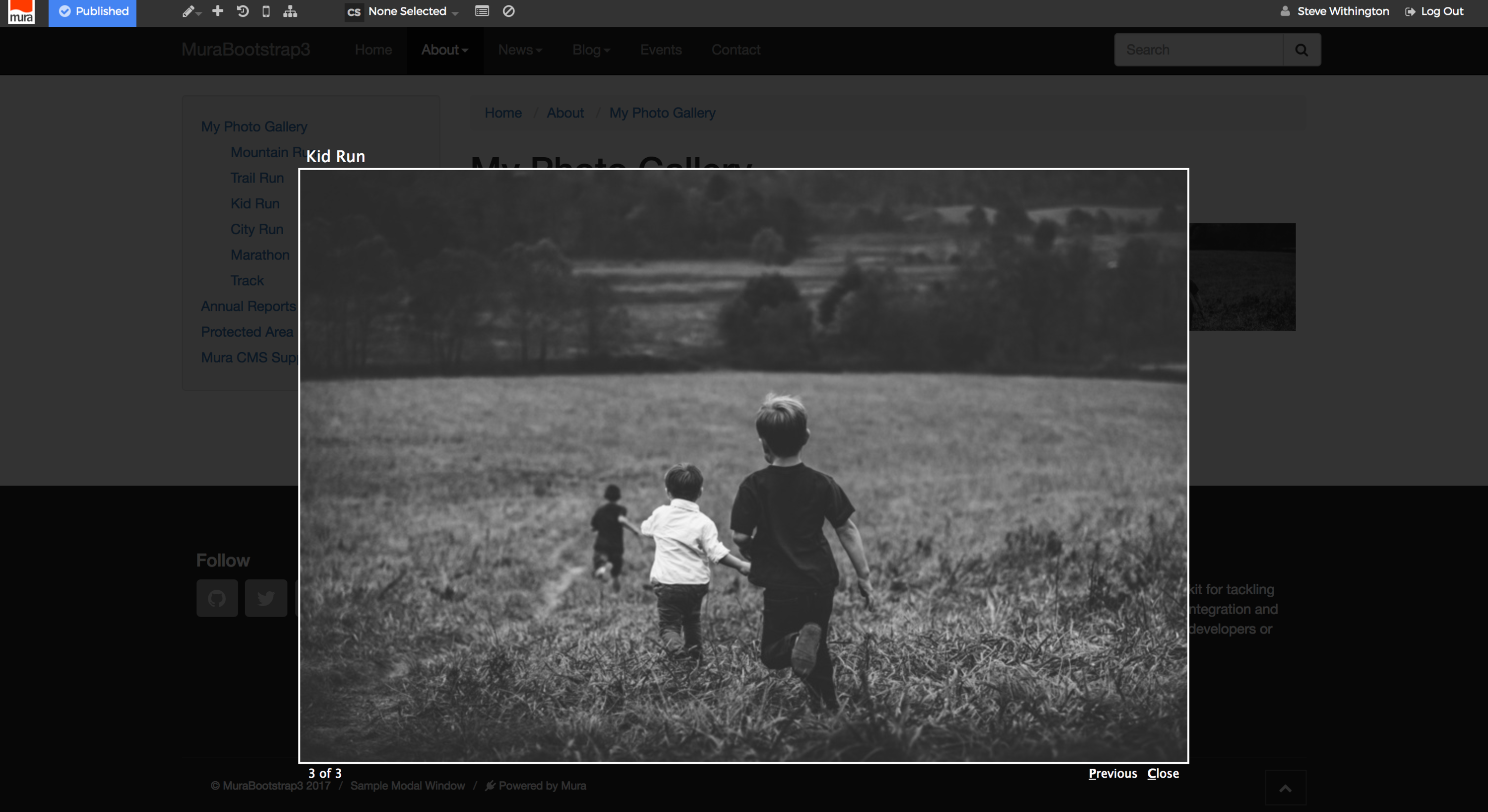
- In addition, on the "Folder" configuration panel, make sure you set "View Images as Gallery" to "True" if you want a modal window to open when a user clicks on an image.
- You may also select the number of "Items Per Page", and if your Folder contains more images than the number selected, Mura will auto-generate pagination for you.
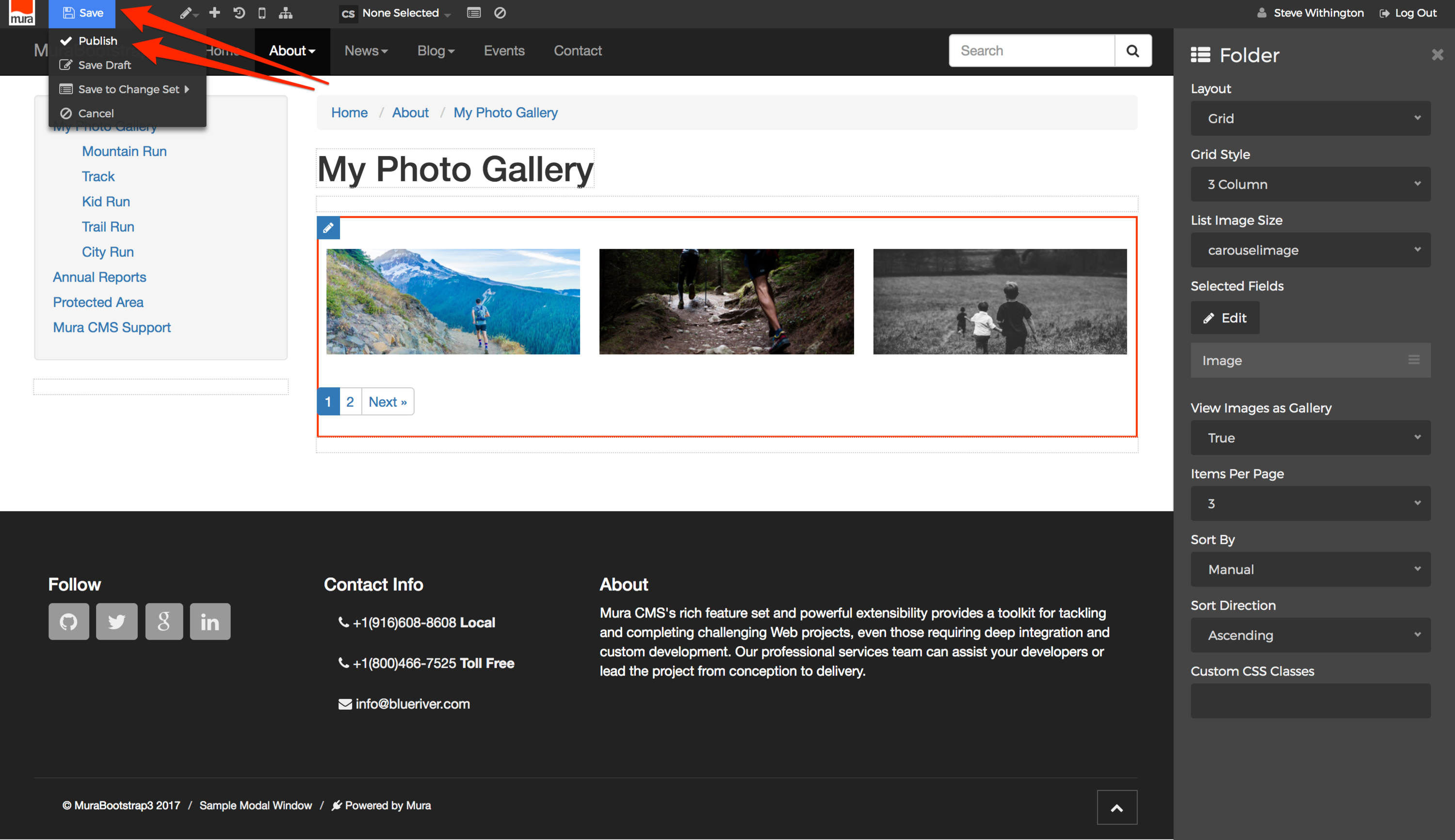
- When finished, be sure to "Save" your changes by hovering over the "Save" button, and selecting your desired publishing option.
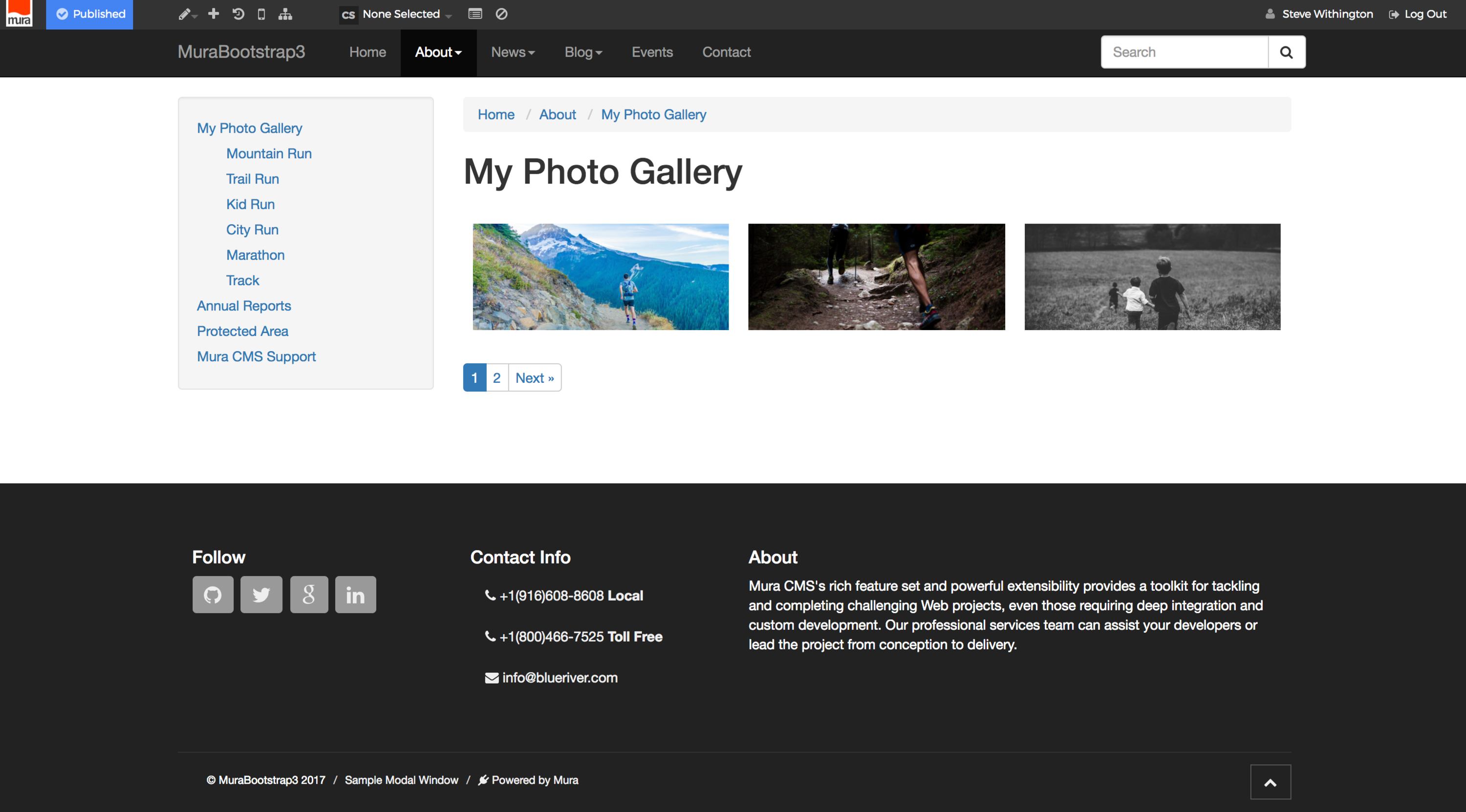
- Your new gallery should now be ready for viewing.
- If you set "View Images as Gallery" to "True", clicking an image will open the image in a modal window.
- If/when you wish to reorder the images, you will need to do so via the back-end administration area, just as you would any other kind of content.
Summary
In this section, we reviewed Mura's content types and got to know the basics of creating/managing content.
In the next section, we'll look at structuring and organizing your content using built-in tools such as navigation menus, categories, tags, and more.
